An art cover for the Yearbook
Passion
An art cover for the Yearbook
David Pearson’s typographic cover art brilliantly captures the drama of the latest Ferrari Yearbook
Words: Ben Barry
Since its first publication in 1949, the Ferrari Yearbook has been eagerly anticipated by customers, enthusiasts and fans alike for its engaging round-up of Ferrari's defining moments over the previous 12 months. It is also renowned for its often-daring front covers.
Now the 2024 Yearbook is following in this proud tradition thanks to a dramatic typographic front cover created by British designer David Pearson.
Pearson describes his work as ‘print-based design that uses typography in expressive ways’. He has designed eye-catching book covers for world famous works of literature and collaborated with luxury fashion brands. In 2015 he was even appointed Royal Designer for Industry, the highest accolade for designers in the UK.
This was Pearson's first commission for the Prancing Horse, but his fascination with the brand dates back to childhood.
‘I used to have a Ferrari F40 poster on my wall as a teenager, so it was a real honour to get this commission as well as a great challenge for me personally as a designer,’ Pearson enthuses.
The Yearbook cover is inspired by past editions but introduces a contemporary style all of its own
His first step was to look through the Ferrari Yearbook archive, both to avoid repeating previous themes and to find inspiration. The more minimalist Yearbook covers proved particularly appealing, especially those from the 1950s and ’60s.
‘My favourites all withheld information in some way,’ notes Pearson. ‘They were mildly suggestive and titillating and didn’t show us too much or become too literal.’
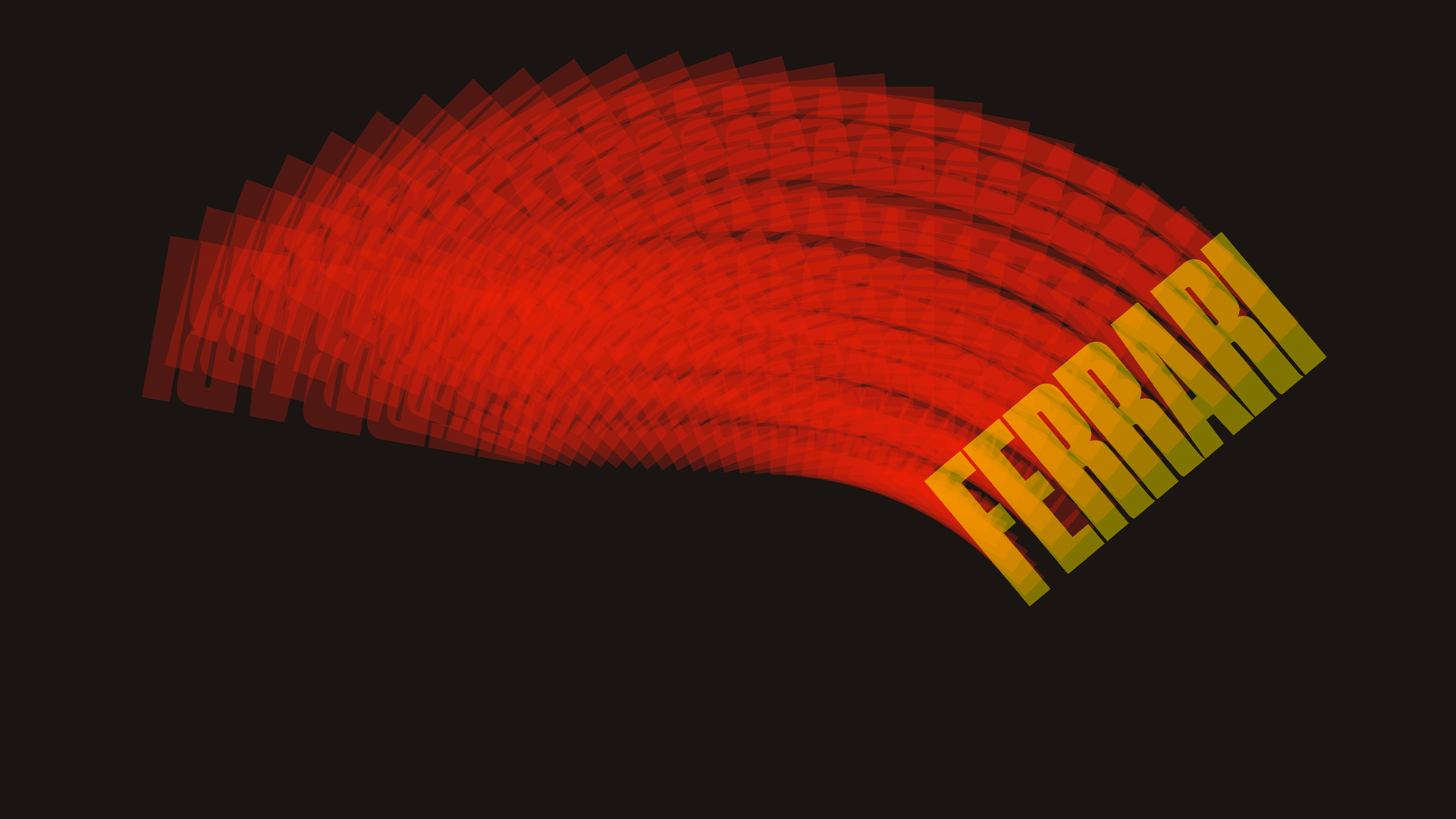
Pearson explored two key design themes as he worked towards the finalised cover. The first used fragments of letters that appeared to speed across the cover, while the second evolved the idea of a rotating Ferrari logo.
It was the latter approach that was ultimately chosen, finalised as a dynamic streak of red that resolves as yellow Ferrari typeface inclined at a dramatic 45-degree angle.
‘It’s an iterative approach that uses light and transparency to lead us from the back cover right across the front, so that only at the last moment do we read the word Ferrari,’ elaborates Pearson. ‘It’s as though the Ferrari has left the production line but has also left a trace of production and craft. Yet the cover holds back on revealing an actual car, inviting the reader to explore more inside.’
The result is a design that fits perfectly in the proud tradition of Ferrari Yearbook covers while establishing a clear identity of its own.
Subscribe to The Official Ferrari Magazine